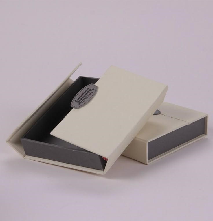
Picture a small shop owner with a great product: a slim card holder, a jewelry set, maybe a set of gift cards for a local spa. The product is solid. The packaging is a plain white carton with a sticker on top. Customers like the item and forget the brand within a week.
That gap between a good product and a memorable one is often just a box. And the wallet-style paper box, the kind that opens like a book, is one of the better ways to close it.
Why the wallet format works
Most boxes ask you to lift a lid and look down into a hole. A wallet box opens sideways and lays everything out in front of you. The product sits there like a display, with nothing to dig for.
The format also happens to be slim. That matters more than people expect, since thin packaging costs less to ship, takes up less shelf space, and fits into a mailer without much fuss. It suits flat items best: cards, jewelry, tickets, invitations, cash gifts, small cosmetics, and compact tech accessories like earbuds or memory cards.
Closures vary. Magnets are the premium choice because they click shut with a satisfying snap. Ribbons feel more like a present. A simple tuck tab keeps costs low when you’re making thousands of units.
Get the inside right before the outside
Designers love to start with the cover art. Resist that. Start with the product and a ruler.
Measure the item at its thickest point. A card holder that looks flat can still be several millimeters thick once you count stitching or a raised logo, and a box built around the wrong number either squeezes the product or lets it slide around. Neither looks good when the customer opens it.
Next, decide how the product will be held. A paperboard tray with a cutout is the cleanest answer for most items. Foam is softer and protects fragile pieces, though it adds a little cost. An elastic band works well for cards. The insert does a lot of quiet work here, because it decides whether the product looks placed or just dropped in.
Then think about the spine. That hinge gets bent every time someone opens the box, so it’s the first place cheap construction gives out. On rigid boxes the hinge is usually wrapped paper over chipboard. On folding cartons it’s a scored crease. Ask the manufacturer how it’s reinforced, and ask for a sample you can open and close fifty times.
Design: less than you think
There are only a few surfaces to work with: the cover, the two inside panels, and sometimes the back. Most brands try to use all of them and end up with something busy.
A quieter approach tends to look pricier. Put a simple logo on the cover, pick one accent color, and save the interesting part for the inside. A bold color on the inner panels or a short printed line gives people a small reward for opening it.
A few practical points that trip people up:
- Screens lie about color. Monitors mix light, while printers layer ink. Bright blues, oranges, and anything neon can shift noticeably. If your brand color has to be exact, request a Pantone match and a printed proof.
- Stay off the folds. Production has a bit of wiggle room, so text sitting right on a crease can end up crooked or clipped. Build the artwork on the manufacturer’s dieline and keep a safe margin.
- Skip the clutter. Whitespace is not wasted space on a small box. It’s what makes the logo readable.
How these boxes get printed
The right printing method mostly comes down to how many boxes you need.
| Method | Best for | Trade-off |
| Offset | Medium to large runs | Sharp, consistent color, but setup costs make small runs pricey |
| Digital | Small batches, test runs, versions with different names | Fast and flexible, but a higher price per box at volume |
| Flexo | Kraft and corrugated materials, simple graphics | Great for one or two colors, less so for fine detail |
| Screen | Thick, vivid ink effects | Slower and less common for standard cartons |
If you’re testing a new design, go digital and see how people respond. Once it sells, switch to offset and let the unit cost drop.
Finishes
This is where a printed box either becomes something people want to hold or turns into a mess.
Matte lamination looks calm and hides fingerprints. Gloss makes colors jump. Soft-touch coating feels almost like suede, and people tend to run a thumb over it without realizing they’re doing it. Spot UV puts a shiny coat on just one area, like a logo on a matte background. Foil stamping adds metallic shine. Embossing pushes a design up from the surface, and debossing presses it into the surface.
My rule of thumb: choose two finishes and execute them well. A tiny box wearing foil, spot UV, embossing, and a glossy coat all at once just looks nervous.
Materials, and why they matter more than the print
You can print a gorgeous design on weak board and it will still feel cheap in the hand. The material sets the tone before anyone reads a word.
Rigid chipboard is what most premium wallet boxes are built from. It’s thick and dense, then wrapped in printed or textured paper. It keeps its shape for years.
SBS paperboard has a bright white, smooth surface that shows off color. It’s the usual pick for folding cartons with detailed graphics.
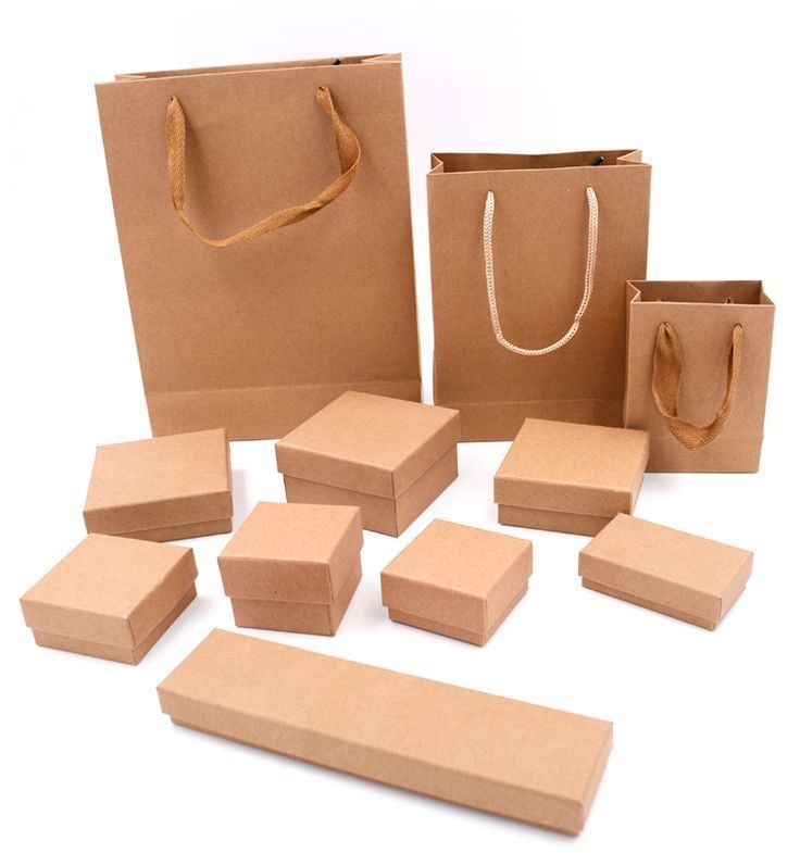
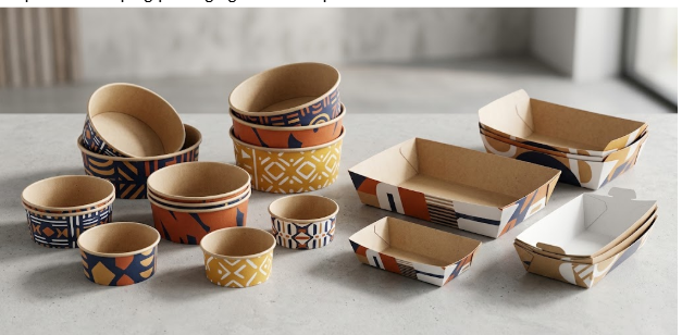
Kraft board gives a natural, slightly rough look that suits handmade and eco-minded brands. Bold, simple designs print best on it.
Fine corrugated (E-flute or F-flute) adds crush resistance, so it’s worth considering when the box ships without an outer carton.
Specialty papers like linen, pearl, and cotton stocks can change the personality of the whole package. Ask for swatches, because photos don’t capture texture.
Thickness is measured in points or grams per square meter, but numbers only go so far. Hold a sample. If it feels flimsy to you, it’ll feel flimsy to your customer.
On sustainability: plenty of US buyers look at packaging waste now. FSC-certified board, recycled content, soy-based inks, and water-based coatings all help. Heavy plastic lamination can make recycling harder, so if eco claims are part of your pitch, mention it to the manufacturer up front.
Mistakes that cost real money
- Approving artwork without a physical sample. A flat mockup can’t tell you how a magnet feels or whether a hinge will hold.
- Forgetting about shipping. A beautiful box that arrives with crushed corners is a refund waiting to happen.
- Picking on price alone. The cheapest quote usually shows its shortcuts in the corners, the print registration, and the spine.
- Underestimating lead times. Custom packaging takes weeks, and the weeks before the winter holidays are the busiest of all.
- Overbuilding the design. Every extra finish adds cost and another chance for something to go wrong.
When it’s time to order in bulk
Once you’ve tested a design and know it sells, ordering larger quantities lowers the price per box and keeps every batch looking the same. Boutiques, event planners, and online sellers commonly buy wholesale wallet paper gift boxes this way, since consistent packaging makes a brand look established even when it’s small.
When you request quotes, send the same specs to every supplier: size, material, print method, finishes, quantity, and delivery date. Otherwise you’ll be comparing prices for slightly different products. Ask about minimum order quantities, how samples are handled, and what happens if the first proof comes back wrong. How a supplier answers those questions tells you a lot about how they’ll behave once your money is in their hands.
Final Words
A wallet box is a small stage for your product. Build the inside to fit the item, keep the outside simple, match the print method to your quantity, and spend your budget on a material that feels good to hold. Most of the rest is detail.